
optimizacion-conversion11 min read
Benchmarking: What It Is, Types, and How to Do It
Complete guide to benchmarking: what it is, the 4 main types, a step-by-step process, and how to compare your conversion rates with your industry...
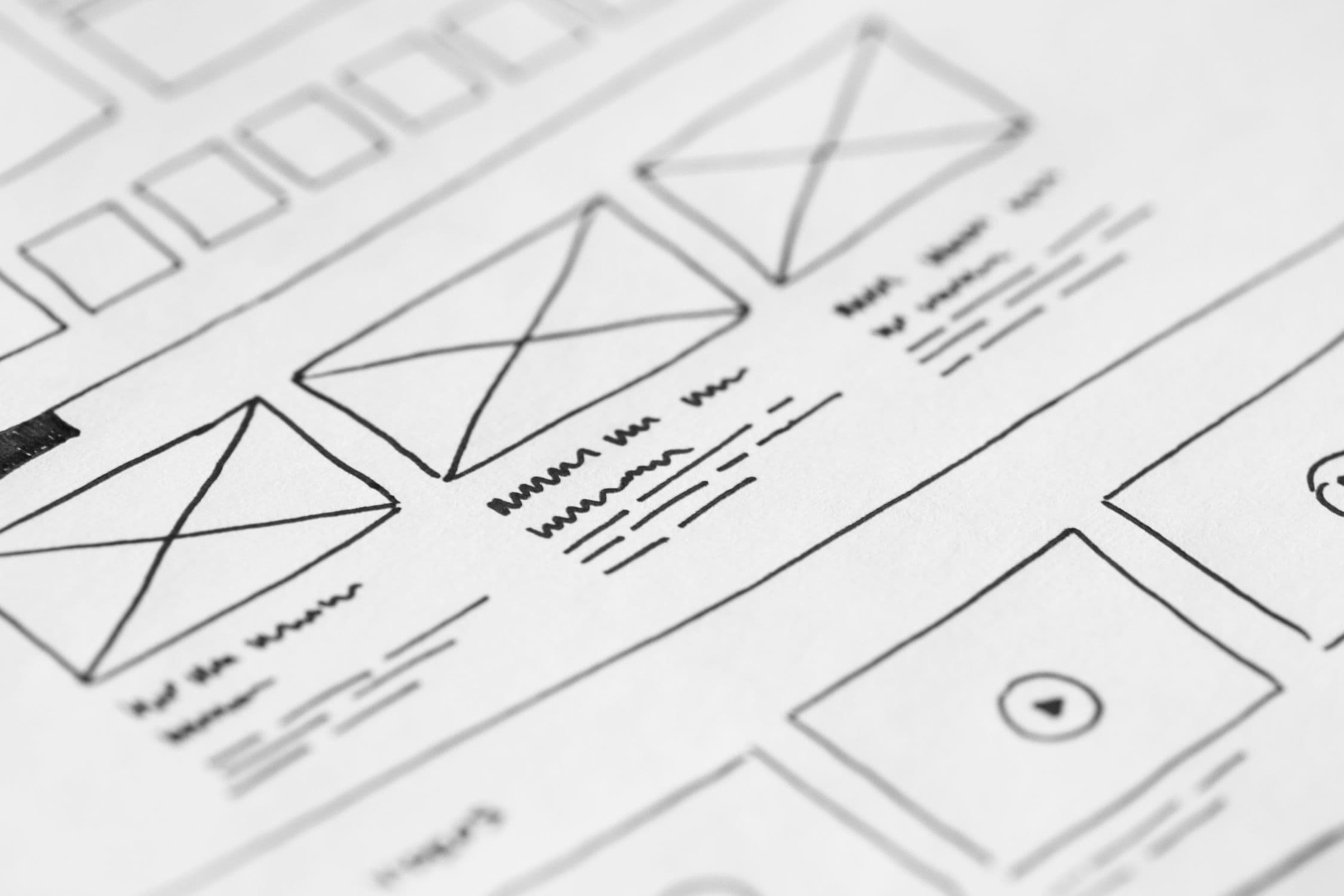
A landing page can have flawless design and brilliant copy, but if the structure doesn't guide the user toward conversion, it won't work. The layout and order of elements aren't arbitrary — they respond to how users process information and make decisions.
A standard web page has a navigation menu, multiple links, and several possible goals. A landing page has a single objective: getting the user to complete a specific action (buy, sign up, request a demo, download).
This means:
It's the first thing the user sees. It should answer three questions in under 5 seconds: what you offer, who it's for, and what they should do.
Minimum elements:
Right below the hero, a row of client logos, media mentions, or a credibility data point ("Trusted by 500+ companies"). It reduces initial friction before the user scrolls.
Users want to know what they gain, not what your product does. Structure benefits in 3–4 blocks with icon, title, and brief description.
| Mistake | Correction |
|---|---|
| "Dashboard with 50 metrics" | "See at a glance what's working and what's not" |
| "Integration with 20 tools" | "Connect with the tools you already use" |
| "Advanced AI algorithm" | "Get recommendations without being a data expert" |
If your product or service isn't immediately intuitive, a block with 3–4 steps simplifies understanding:
This block reduces the uncertainty ("Will this be complicated?") that blocks conversion.
This is where full testimonials, case studies, or concrete results go. Social proof works best when it's:
Users who reach this point are interested but have doubts. Anticipate the most common objections:
Repeat the main CTA, this time with an additional argument: a guarantee, an urgency incentive, or a value summary. The user who has scrolled all the way down is more ready to convert than one who just arrived.
Only the essentials: legal notice, privacy policy, and contact details. No links that pull the user away from conversion.
Before launching, run these checks:
A landing page structure isn't a rigid template, but it does follow principles validated by behavioral psychology and thousands of A/B tests. The right order of elements reduces friction, builds progressive trust, and guides the user toward conversion naturally.
At Boost we help companies convert more with data. If you want to improve your landing pages, try our free Scan&Boost.
Complete guide to benchmarking: what it is, the 4 main types, a step-by-step process, and how to compare your conversion rates with your industry...
The Facebook Ad Library lets you view all active ads from any advertiser. Learn how to use it to analyze competitors and improve your campaigns.
A CRO audit reveals exactly why your website is losing conversions. Follow this step-by-step checklist to find and fix the leaks in your funnel.