
optimizacion-conversion7 min read
CRO Consultant: Role and When to Hire
What a CRO consultant does, how it differs from an agency, required skills, working process and when it makes sense to hire one.

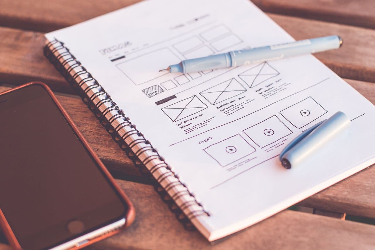
A one page website is a site that concentrates all its content on a single page. Instead of distributing information across separate sections with different URLs (home, services, about us, contact), a one page presents all content in a continuous vertical flow. The user navigates by scrolling, and menu links lead to different sections within the same page via anchor links.
The concept is not new, but it has gained popularity in recent years thanks to the evolution of responsive design and changing browsing habits: users are increasingly accustomed to scrolling, especially on mobile devices.
Although they are sometimes confused, a one page website and a landing page are not exactly the same thing. A landing page is a page designed with a specific conversion objective (capturing a lead, selling a product) and generally forms part of a larger website. A one page website is the entire site: it is the only page that exists.
You can have a one page website that functions as a landing page, but not all landing pages are one page websites. If you want to dive deeper into landing page optimisation, we recommend our guide on what a landing page is and how to optimise it.
Like everything in web design and conversion, the one page has clear trade-offs. It is neither better nor worse than a multi-page site; it is more or less suitable depending on the context.
| Advantages | Disadvantages |
|---|---|
| Controlled narrative: you guide the user through a linear flow | SEO limitations: a single URL to rank |
| Lower development and maintenance cost | Does not scale well if you need a lot of content |
| Native mobile experience (natural scrolling) | Longer initial load time if there is a lot of content |
| Potentially high conversion rate (no distractions) | More limited analytics (difficult to measure by section) |
| More cohesive design with visual impact | Not suitable for product catalogues or blogs |
| Fast development speed for MVPs | Difficult to share specific sections by URL |
Let us develop each point in more detail.
If you are a designer, photographer, consultant or any professional who needs to showcase their work and generate contacts, a one page is ideal. Your professional story is told linearly: who you are, what you do, your work, testimonials, contact. You do not need more.
When you launch a specific campaign with a clear objective (event registration, resource download, product pre-sale), a one page eliminates all distractions and concentrates the user on a single action.
An event has a date, a venue, speakers and a registration form. All that information fits perfectly on a single page. Additionally, the time urgency means you do not need a complex structure to maintain for years.
If you are validating a business idea and need a quick web presence to test demand, a one page lets you launch in days instead of weeks. You can iterate quickly on content and value proposition without worrying about site architecture.
If your business has a single product or a very defined service, a one page can be more effective than a multi-page site with half-empty sections. The rule is: if your story can be told in a linear flow without branching, the one page works.
If you sell multiple products, you need individual pages for each one. A one page cannot contain detailed product cards, search filters, categories and a functional checkout flow.
If content is a central part of your strategy (and it should be if you are doing content marketing), you need individual pages for each article. A one page cannot house a blog with hundreds of posts.
If you offer strategic consultancy, technical implementation, training and support, each service needs its own page with detailed information. Trying to fit everything into a one page would result in an endless page that nobody would read in full.
If your growth strategy depends on organic positioning, a one page is a serious limitation. You only have one URL to rank, which means you can only compete for a limited group of keywords. A multi-page site can rank each page for a different set of search terms.
If you have a user panel, dashboard or client area, the one page is not the right format. These features require a multi-page architecture with authentication and protected routes.
If you have decided that the one page is the right format for your case, these are the best practices to maximise conversion.
The greatest advantage of a one page is control over the narrative. Make the most of it. Organise content in a flow that naturally leads the user from the problem to the solution:
A one page tends to be heavy because it loads all content at once. And as we analyse in our guide on page load speed and conversion, every additional second of load time significantly reduces conversion rate.
Strategies to optimise speed:
Scrolling is the primary navigation mechanism on a one page. Make sure it works well:
On a multi-page site, each page can have its own CTA. On a one page, you need to repeat the call to action at several points in the scroll. The general rule is to include a visible CTA at least every two sections, alternating between primary CTAs (prominent button) and secondary ones (text with link).
Do not place the CTA only at the end. Many users will not reach the bottom of the page. Place a CTA after the hero, after the benefits and after the social proof, as a minimum.
If your one page includes a contact or registration form, every additional field reduces the completion rate. On a one page, the user has already made the effort to scroll to the form; do not lose them with a 10-field form.
Best practices for forms on a one page:
Standard analytics treats your one page as a single page, which leaves you blind to actual user behaviour. Implement advanced tracking:
With this data you can build a "scroll funnel" that shows you where you lose users, similar to a traditional conversion funnel but adapted to the one page format.
| Metric | What it tells you | Indicative benchmark |
|---|---|---|
| Average scroll depth | How far users get | > 50% of the content |
| Conversion rate | Percentage who complete the target action | 5-15% (landing with qualified traffic) |
| Time on page | How long they spend exploring | 2-5 minutes |
| Bounce rate | Percentage who leave without interacting | < 40% (with qualified traffic) |
| CTA click rate | Percentage who click on CTAs | 3-8% of total visitors |
Testing on a one page has its particularities. You cannot easily do split URL testing (you only have one URL), so tests are done with client-side testing tools that modify page content without changing the URL.
Elements that tend to work well in one page A/B tests:
This is the key point of this article. Simplicity, when well executed, converts. A one page eliminates distractions, controls the narrative and focuses the user's attention on a single action.
The problem is not the format, but the execution. A poorly designed, slow one page with no clear value proposition and no strategic CTAs will not convert well. But a one page with a powerful message, a solid narrative structure, optimised load speed and well-positioned CTAs can outperform a multi-page site where the user gets lost among dozens of options.
The key is understanding when the one page is the right format and, if it is, optimising it rigorously. It is not about design trends, it is about effectiveness.
Many projects start as a one page and evolve into multi-page sites as they grow. That is a perfectly valid path. Start simple, validate your value proposition, and when you have enough data to justify the investment in a more complex site, scale.
What you should not do is start with a complex multi-page site if you are not clear about what works. It is easier to expand a one page that works than to simplify a complex site that does not convert.
If you need to optimise your one page website or evaluate whether it is the right format for your business, at Boost we are a consultancy specialising in conversion. We analyse your specific case, identify improvement opportunities and design an experience that maximises your results.
What a CRO consultant does, how it differs from an agency, required skills, working process and when it makes sense to hire one.
What dark patterns are, most common types, real examples, European legislation and ethical alternatives that improve conversion without deceiving users.
Discover what demand generation is, how it differs from lead gen and how to apply effective strategies to generate real demand for your business.