

optimizacion-conversion4 min read
Progress bar in checkout: sell more
Are your customers abandoning their cart at the last second? Discover why a progress bar checkout offers immediate benefits to your conversion rate and...
You may have noticed that you are hearing the term "data visualisation" more and more often. That is not surprising — although it has existed for a long time, it has gained even greater relevance in recent years. In this article we cover everything about this fascinating tool for online businesses.
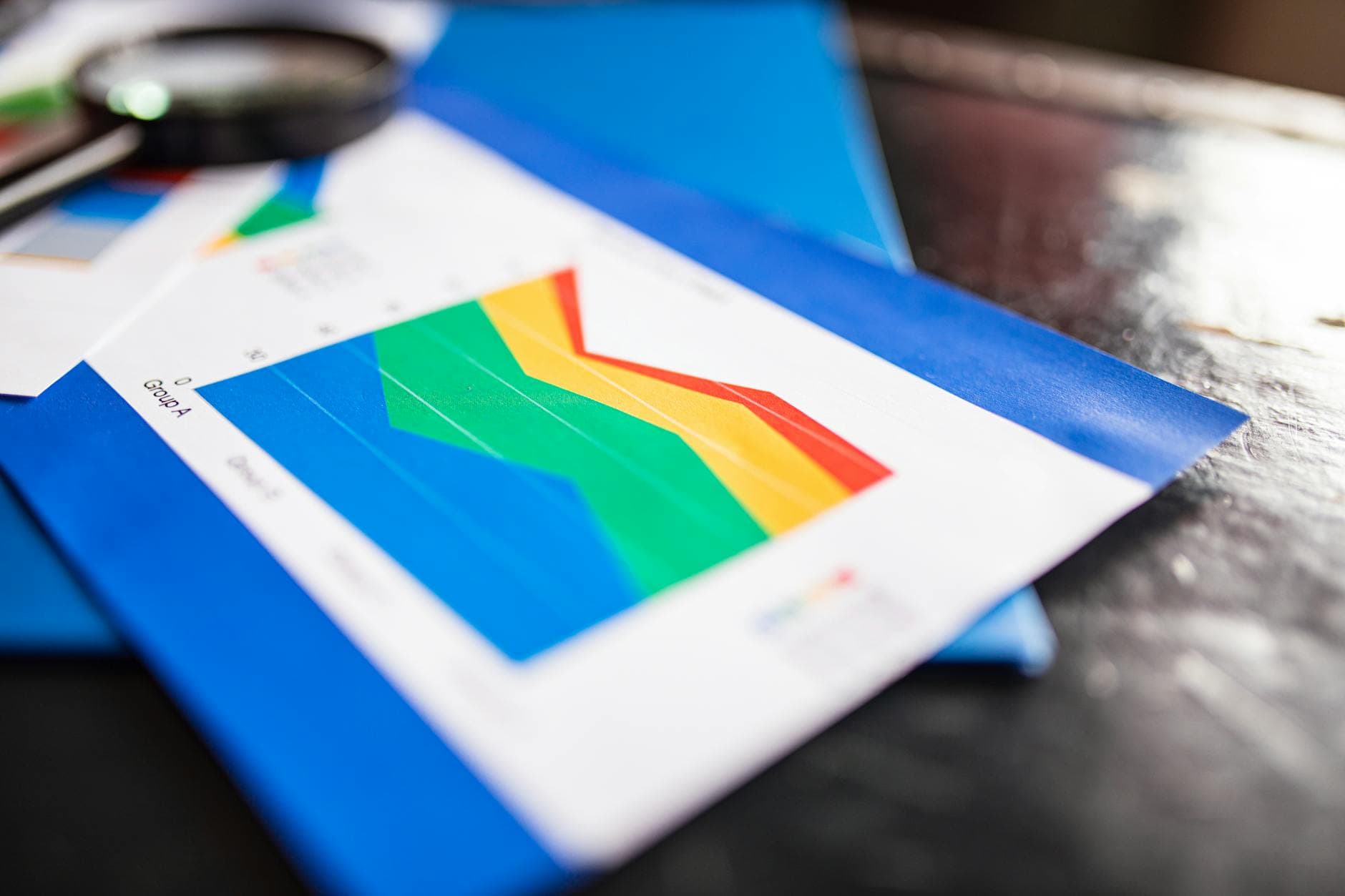
To give you a quick idea, data visualisation refers to the visual representation of information. Graphs, tables, maps and other common visual elements are used to present data and information in a clear, comprehensible way.
This tool is very powerful when it comes to analysing, understanding and communicating data effectively. It transforms information into clear images, making it easier to identify patterns, trends and relationships that might go unnoticed in a raw data set.
Data visualisation has a more important purpose than simply representing data visually. In fact, there are several reasons why data visualisation should be a fundamental tool in your digital business. Here they are:
In general, we understand complex information more quickly when it is presented visually rather than as raw data or text. Visuals also allow us to identify patterns, trends and relationships between data intuitively, which facilitates understanding and informed decision-making.
Data visualisation can help identify hidden patterns and trends in data — something that can be difficult to detect in raw data form. By representing data in graphs, a deeper and more meaningful view of the information is obtained.
Data visualisation is a key tool for communicating complex information effectively. It allows data to be presented clearly and concisely to a client, partner or even supplier, facilitating data-driven decision-making and comprehension of information by stakeholders. Moreover, presenting data visually is often more persuasive and compelling than raw data or verbal descriptions.
This tool is also useful for detecting errors and anomalies in data. By representing data in charts or graphs, inconsistencies or discrepancies in the information are more likely to be identified, enabling quick correction and more precise decision-making.
Data visualisation is essential for making data-driven decisions. By representing data in a clear and comprehensible way, it allows different options to be evaluated and the best option to be selected — one supported by concrete, real data. It is useful for reducing uncertainty and minimising the risks associated with decision-making based on assumptions or intuitions.
Data visualisation plays a key role in helping with conversion for a website or online business in several ways:
Data visualisation can help identify patterns and trends in user behaviour on a website or online business.
For example, by visualising web traffic analytics data, you can identify pages that receive the most visits, geographic areas with the highest interaction, peak activity times, and more. This information allows you to identify opportunities to optimise the design and content of the website, improve the user experience and increase the conversion rate.
Data visualisation can also help to evaluate the effectiveness of digital marketing strategies, such as digital advertising campaigns, email marketing or social media.
By visualising marketing analytics data, you can identify the strategies that generate the greatest return on investment, the marketing channels that generate the most traffic or conversions, and the audience that shows the most interest in the products or services offered.
Data visualisation can help understand how users interact with a website or online business. For example, by visualising heatmap data, you can identify which areas of a website receive the most attention or clicks, and which areas are ignored or overlooked.
Knowing this is very valuable for making adjustments to the design and layout of elements on the page to improve user experience, optimise navigation and increase the conversion rate.
Real-time data visualisation can help monitor the performance of a website or online business in real time.
For example, updated information can be obtained on key metrics such as number of visitors, conversions, average purchase value, time on site, and more. This makes it possible to quickly identify any anomaly or emerging trend and take proactive decisions to improve performance and conversion.
In summary, we recommend you consider data visualisation as a very powerful tool capable of improving the conversion of your website or online business by helping you identify patterns, analyse the effectiveness of marketing strategies, improve the user experience and monitor performance in real time.
You will be able to make informed decisions based on data and optimise the design, content and marketing strategies to increase the conversion rate successfully. In addition, you will have a tool capable of convincing your clients, partners and suppliers because data displayed visually is clearer, more convincing and more persuasive.
If you do not know where to start, we can help you. And if you have a basic understanding of data visualisation but feel you are not getting enough out of it, we can also lend a hand. Contact us and tell us about your situation so we can assess whether we can help you achieve your goals.
Are your customers abandoning their cart at the last second? Discover why a progress bar checkout offers immediate benefits to your conversion rate and...
Is your website slow and losing customers? Discover how to improve Web Vitals for conversion. Analyze your e-commerce performance with Scan & Boost and...
Discover how to define CRO hypotheses following the scientific method and integrating AI to scale your sales with Boost.

