
estrategia-data-driven10 min read
KPIs for digital marketing: how to measure ROI
Measuring your campaign performance correctly doesn't depend on the amount of data you collect, but on your ability to focus on the KPIs that truly move...
In the age of (over)information, the correct use of data has become a key pillar for business success. Data visualisation plays a crucial role in this, but did you know that a poor representation can cost you clients and cause confusion? Discover in this article how to avoid the most common mistakes and achieve a clear, accurate presentation of your data.
In a world where data drives decisions at every level of a business or project, the ability to transform numbers into visual stories (we discussed Data Storytelling in a previous post at Data Storytelling) has become essential.
But watch out! Data visualisation can be a double-edged sword. A poor representation of data can lead to incorrect interpretations and harm decision-making. Fortunately, there are methods and strategies that, when applied correctly, can help you communicate with maximum accuracy and clarity.
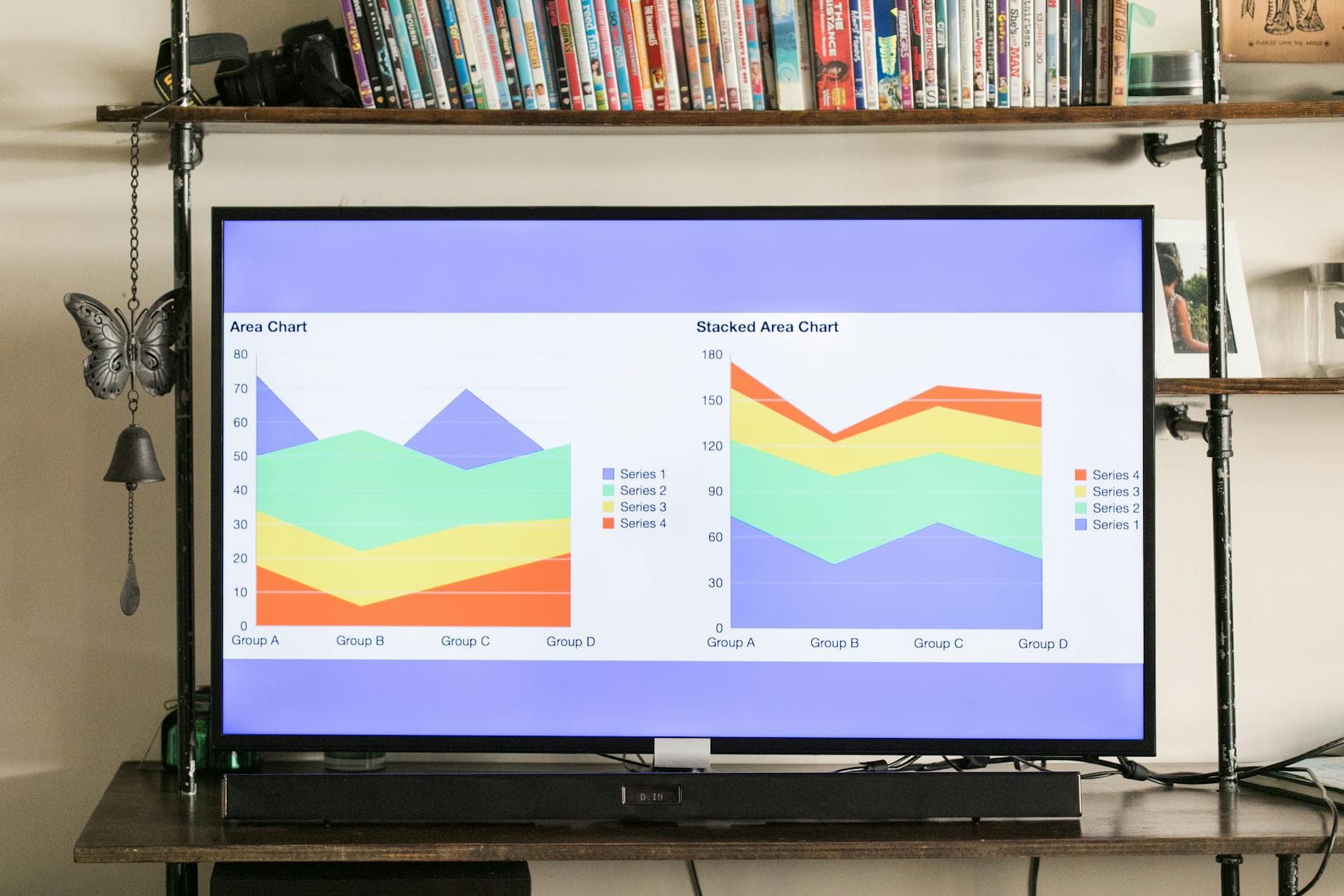
One of the most frequently wrong decisions is choosing the wrong chart type to represent data. Why? Because each chart type has its own purpose and suits certain types of data — not all of them work for everything. For example, bar charts are great for comparing quantities across different categories or months, while pie charts are useful for showing proportions.
Choosing the wrong chart type can lead to misinterpretation of the data. Our advice: before committing to a particular chart type, think carefully about which aspect of the data you want to highlight. That way you can determine which type of chart best fits that need.
First impressions matter — even in charts. That is why design is key to making your data easy to understand quickly. It is not about adding lots of decorative elements. What matters most is that your visualisations are tidy, clean and aesthetically pleasing, avoiding too many colours, graphic elements and unnecessary flourishes that can distract.
The goal is for design to help make data easy to understand and compare, rather than making it complicated. A detail that always adds value is using your company's brand colours — this builds trust and makes your employees or clients feel more at home.
Design is undeniably important, as we have discussed. But did you know that one of the most common mistakes is overlooking the chart axes?
Even if the data you display is accurate, the way it is presented can distort its meaning. So make sure you label your axes correctly, clearly indicating what variables are being represented. This will prevent confusion and allow users — whether employees, suppliers or potential clients — to interpret the data correctly.
In addition to presenting data visually and clearly, it is very important to be transparent about where the data comes from. This is what truly sets apart data that lacks context from data that is well-grounded.
Avoid making this mistake. Always include a reference to the data source (whether internal or external). Doing so not only increases confidence and credibility in your representations, but also gives people the opportunity to review the details or dig deeper if they wish.
This point may seem obvious, but it is still worth addressing. Bias in data visualisation is a dangerous silent enemy. You must do everything possible to prevent bias from influencing your visualisations, as it can distort the information you communicate and lead your business to make wrong decisions.
Try to maintain an impartial and objective perspective when creating your visual representations, letting the numbers speak for themselves. Remember that numbers, even when they do not show good results, are the key to identifying improvements and truly understanding the project's potential.
As you have seen, data visualisation goes beyond just plotting numbers on a chart. It requires a deep understanding of the data, as well as a precise and clear approach.
Avoiding common mistakes such as unclear axes, missing source references, bias and the wrong choice of charts is essential to achieving effective communication and increasing your business opportunities. When it comes to design, try to innovate to make representations interesting (let your imagination run free occasionally!) while ensuring they are aesthetically pleasing and easy to understand.
With these guidelines in mind, you will create data visualisations that not only inform but also inspire smart, strategic decisions at every level of your organisation. Remember, every chart is an opportunity to tell an accurate and persuasive story — so when you need to create a data visualisation, do it with rigour and creativity.
If you want to learn a bit more about what data visualisation is and why it matters for your business, we cover that in this article. And if you want to win more clients and increase revenue through data visualisation but do not know where to start, write to us to see if we can help with what you need.
Measuring your campaign performance correctly doesn't depend on the amount of data you collect, but on your ability to focus on the KPIs that truly move...
Discover how to apply data-driven marketing decisions to optimise campaigns, reduce errors and improve results compared to intuition.
Every company has data. Simply by existing in a digital environment, information accumulates and digital analytics becomes a reality (whether you want...