

optimizacion-conversion5 min read
BNPL: Buy Now Pay Later for ecommerce
Deferred payment reduces cart abandonment by up to 20%. Discover how to implement BNPL in your store and when it actually makes sense.
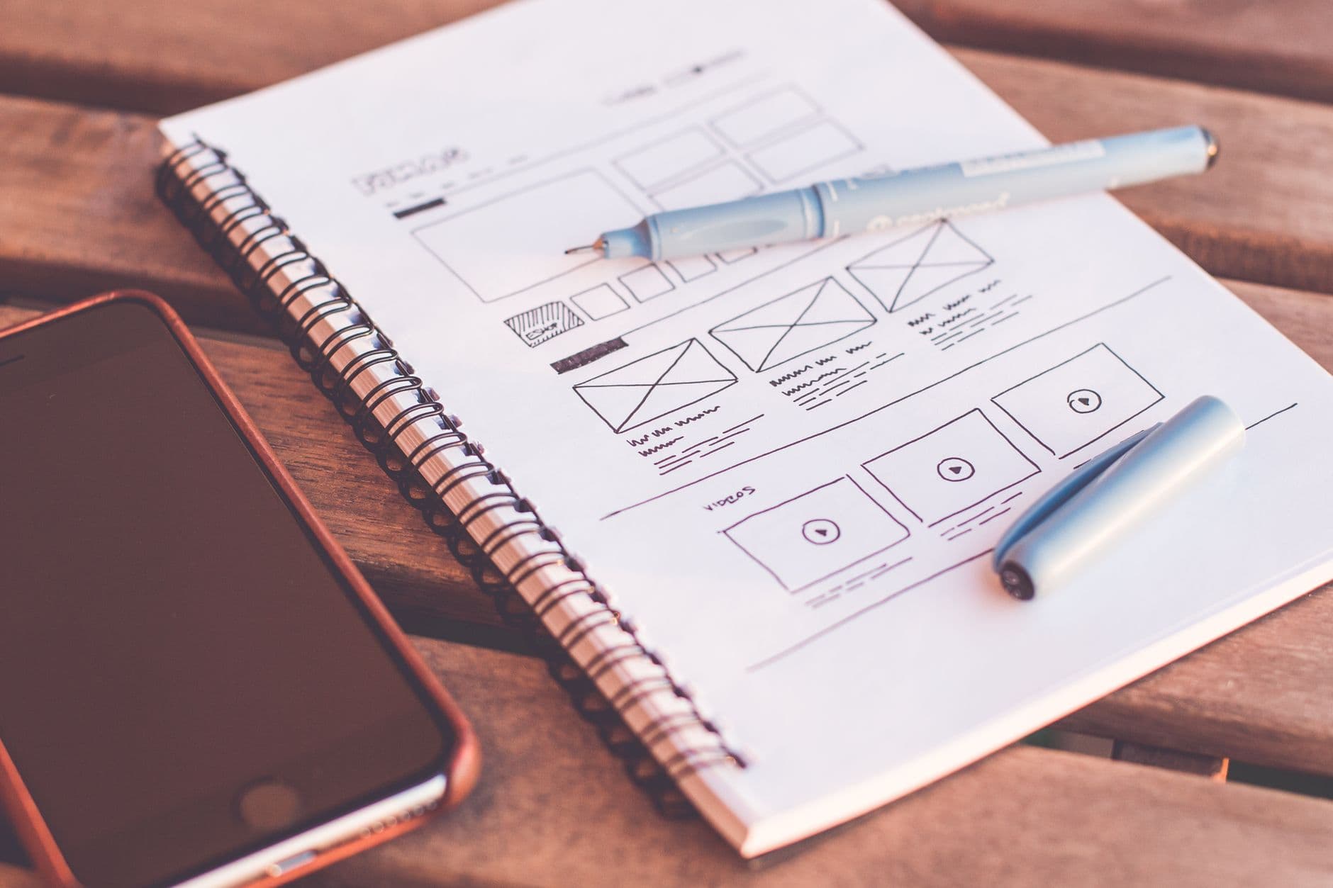
UX (User Experience) is the discipline responsible for designing products and services that are useful, easy to use, and satisfying for the user. It is not limited to visual design: it encompasses the entire user journey, from discovering your product to using it, recommending it, or abandoning it.
The term was popularised by Don Norman in the 1990s while working at Apple. Norman defined user experience as "everything that touches the user in their interaction with the company: the packaging, the service, the store, the website, the product itself."
In the digital context, UX determines whether a visitor finds what they are looking for, understands how your website works, trusts your brand, and completes the action you want them to complete (buy, register, contact). Good UX is not invisible: it is the reason a user comes back.
UI (User Interface) is the discipline responsible for designing the visual and interactive elements the user directly interacts with. It includes buttons, forms, navigation menus, typography, colours, icons, animations, and the visual layout of on-screen elements.
If UX defines what the product should do and how it should work, UI defines how it looks and how it feels. UI is the visual layer of UX.
A UI designer takes the interaction decisions defined by UX and translates them into concrete visual elements: choosing the colour palette, typography, button style, screen transitions, and component states (hover, active, disabled, error).
Confusion between UX and UI is common, even among industry professionals. They are complementary but distinct disciplines, and confusing them leads to incomplete design decisions.
| Aspect | UX (User Experience) | UI (User Interface) |
|---|---|---|
| Focus | How the product works | How the product looks |
| Objective | Make it useful, usable, and satisfying | Make it attractive, coherent, and clear |
| Deliverables | Wireframes, user flows, navigation maps, prototypes | Mockups, style guides, visual components, final design |
| Skills | Research, information architecture, usability testing | Visual design, typography, composition, animation |
| Tools | Figma (wireframes), Hotjar, UserTesting, Optimal Workshop | Figma (design), Sketch, Adobe XD, Principle |
| Key question | Can the user complete their task easily? | Does the user visually understand what to do? |
| Analogy | A house's architecture: layout, flow, functionality | Interior decoration: colours, materials, style |
A helpful analogy: UX is like the architecture of a restaurant (customer flow, table layout, kitchen location) and UI is like the decor (lighting, colours, tableware, the menu). You can have a beautiful restaurant (good UI) where customers cannot find the entrance (bad UX), or a functional but unappealing restaurant (good UX, bad UI). Ideally, both work together.
Usability measures how easily a user can complete their tasks. A usable product requires no instructions, generates no doubts, and does not produce frequent errors.
Jakob Nielsen, one of the leading usability experts, defined 5 components:
Accessibility ensures the product can be used by people with different abilities: visual, auditory, motor, or cognitive. It is not an extra: it is a legal requirement in many countries and a good business practice.
An accessible website uses adequate colour contrasts (minimum 4.5:1 ratio per WCAG), allows keyboard navigation, includes alternative text on images, uses a logical heading structure, and works correctly with screen readers.
Beyond being the right thing to do, accessibility expands your potential audience. Approximately 15% of the world's population has some form of disability. Ignoring accessibility means ignoring a significant portion of your market.
A product has good findability when the user can easily find what they are looking for. This includes information architecture (how content is organised), the navigation system (menus, breadcrumbs, filters), and the internal search function.
In e-commerce, findability is critical. If a user cannot find the product they are looking for in fewer than 3 clicks, they are likely to leave and go to a competitor. Product filters, search bar with autocomplete, and logical categorisation are UX elements that directly impact conversion.
UX also affects the perception of trust. A website with professional design, clear company information, transparent policies, and visible security certificates generates more trust than one with amateur design, typos, and no contact information.
Credibility elements include: customer testimonials, logos of companies you work with, certifications, clear return policies, security seals, and the presence of a visible human team (photos, names, roles).
A product has good UX when it solves a real user problem. Utility is the most fundamental principle: if the product serves no purpose, it does not matter how beautiful or easy to use it is.
Before designing any feature, the question is: does this solve a real problem the user has? If the answer is no, it should not exist.
The connection between UX/UI and conversion rate is direct and measurable. Every friction point in the user experience is an abandonment opportunity. Every usability improvement is a conversion opportunity.
Industry studies show clear patterns about the return on UX investment:
| Data point | Source / context | Implication for CRO |
|---|---|---|
| Every $1 invested in UX generates $10 to $100 in return | Forrester Research | UX is the investment with the highest ROI in digital |
| 88% of users do not return after a bad experience | Web usability studies | The first impression is irreversible |
| 70% of online carts are abandoned | Baymard Institute | Many abandonments are checkout UX problems |
| A form with reduced fields can increase conversions by 120% | Documented A/B tests | Less friction = more conversions |
| Load speed affects conversion: each additional second reduces conversions by 7% | Google / Akamai | Performance is UX |
Navigation and information architecture. If the user cannot find what they are looking for, they do not convert. Clear navigation, with logical categories and a maximum of 7 main options, reduces cognitive load and facilitates the path to conversion.
Forms. Forms are critical friction points. Each additional field you ask for reduces the completion rate. Best practices include: asking only for essential information, using autocomplete, showing real-time validation, clearly indicating required fields, and dividing long forms into steps.
Checkout process. In e-commerce, checkout is where most money is lost. The most effective UX improvements include: guest checkout (no mandatory registration), progress indicator, visible order summary, multiple payment methods, and trust messages next to the purchase button.
Mobile experience. Over 60% of web traffic is mobile, but mobile conversion rates remain significantly lower than desktop. The most common causes are: buttons too small, forms difficult to complete, intrusive popups, and slow load times.
Visual hierarchy. Visual hierarchy design guides the user's attention towards the most important elements. Good UI design uses size, colour, contrast, position, and white space to create a clear visual flow leading to the main CTA.
Before designing, you need to understand. The research phase includes:
With research data, the product structure is defined: what content to include, how to organise it, and what flow the user will follow. Wireframes are low-fidelity schematic representations that define element layout without going into visual details.
The UI designer takes the wireframes and applies the brand's visual identity: colours, typography, images, icons, and component styles. The result is a high-fidelity mockup representing the product's final appearance.
The interactive prototype simulates the real user experience and detects problems before investing in development. Usability tests with real users are the most effective way to validate design decisions.
After development and implementation, the continuous improvement cycle begins. Using A/B testing, design hypotheses are validated with real traffic and the elements with the greatest conversion impact are optimised.
UX is not only visual. Text (UX Writing or microcopy) is one of the most influential elements in the user experience and, by extension, in conversion.
Every interface text (button labels, error messages, form instructions, confirmations) is an opportunity to guide the user, reduce uncertainty, and build trust.
Error messages are a clear example: a generic message like "Error: incorrect data" generates frustration. A helpful message like "The email you entered is not in a valid format. Example: name@company.com" helps the user resolve the issue and continue.
Jakob Nielsen's 10 usability heuristics are the most widely used checklist in the industry for evaluating the UX of a digital product:
Visibility of system status. The system should always keep the user informed about what is happening (progress bars, confirmations, loading indicators).
Match between system and real world. The system should use the user's language, not technical jargon. Concepts, words, and images should be familiar.
User control and freedom. The user should be able to undo actions, go back, and exit processes without consequences. The "emergency exit" should always be available.
Consistency and standards. Elements that look the same should behave the same. Interaction patterns should be consistent throughout the platform.
Error prevention. Better than a good error message is a design that prevents the error. Disabling unavailable options, confirming destructive actions, and using smart constraints.
Recognition rather than recall. Show visible options rather than forcing the user to remember information from one screen to another.
Flexibility and efficiency of use. Shortcuts for expert users without complicating the experience for beginners.
Aesthetic and minimalist design. Every additional visual element competes with relevant information. Less is more.
Help users recognise, diagnose, and recover from errors. Error messages should be in plain language, indicate the problem, and suggest a solution.
Help and documentation. While the product should be intuitive without documentation, when needed, it should be easy to find and task-oriented.
In a market where products and prices are increasingly similar, user experience is the differentiator. Companies that invest in UX/UI not only improve their conversion rates: they build a competitive advantage that is hard to replicate.
A competitor can copy your price in a day. They can copy your catalogue in a week. But replicating an exceptional user experience requires research, design, testing, and iteration over months. That is the barrier to entry that UX builds.
In the CRO programmes we run at Boost, UX is the foundation of every hypothesis. We do not test random aesthetic changes: we test usability improvements based on real user behaviour data. The result: over 1,000 optimisation actions and an average 47.8% conversion increase.
The question is not whether your website has "good UX." The question is: how many conversions are you losing due to UX problems you do not even know exist?
Want to discover the UX problems holding back your conversions? At Boost, we analyse your website with real data and design measurable improvements. Start with a free audit at Scan&Boost.
Adrià Vidal is the founder of Boost. +1,000 optimisation actions, +47.8% average conversion increase per client, +7.8M EUR in additional revenue generated.
Deferred payment reduces cart abandonment by up to 20%. Discover how to implement BNPL in your store and when it actually makes sense.
A well-designed popup at the moment of exit can recover between 15% and 30% of the revenue you were about to lose. Here's how to do it right.
CRO explained for executives: why to optimize before investing in traffic, which metrics to track, how to evaluate an agency and a sample ROI case.

