
optimizacion-conversion6 min read
Affiliate Marketing: What It Is and How It Works
What affiliate marketing is, how it works, commission models (CPA, CPS, CPL), top platforms, pros, cons and how to measure conversion.
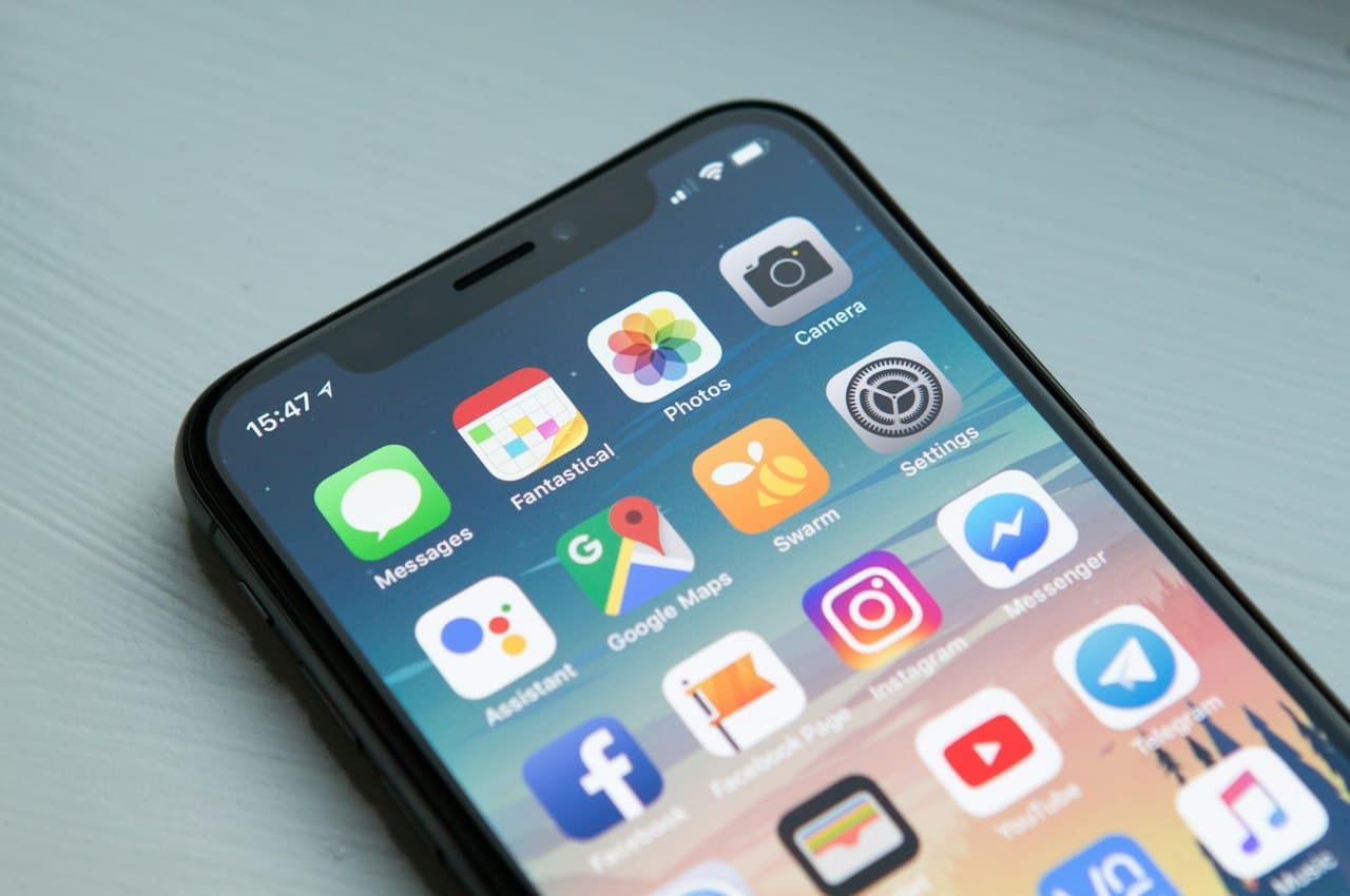
Scrolling is one of the most natural and frequent interactions on the web. We do it dozens of times a day without thinking: swiping on a phone or spinning the mouse wheel to see more content. But behind this everyday action lie design decisions that directly impact user experience and conversion.
In this article we will explain what scroll means in UX, what types exist, how to measure scroll depth as a CRO metric, and what the best practices are to make sure users reach exactly where you need them to.
In the web context, scroll (or scrolling) is the action of moving a page's visible content up, down, left, or right to access content that does not fit on the screen. The term comes from the English to scroll, meaning to move or roll through.
Scrolling exists because web pages contain more information than a single screen can display at once. In the early days of the web, there was a myth that "everything important must be above the fold." Today, in the mobile era, scrolling is the primary way people consume content.
Not all scrolling is the same. Each type has its advantages, its risks, and its optimal use cases.
The standard scroll: the page has a defined beginning and end. The user scrolls down and, upon reaching the footer, there is no more content. It is the most predictable and the most widely used.
When to use it: on most web pages — articles, landing pages, product pages.
Content loads automatically as the user scrolls, with no need to click "next." There is no visible end.
Examples: social media feeds (Instagram, X), Pinterest, some e-commerce sites.
Advantages:
Disadvantages:
Different design layers move at different speeds during scrolling, creating a three-dimensional depth effect. It is visually striking but can be problematic.
Advantages:
Disadvantages:
Certain page elements — such as the navigation, a CTA, or a summary — remain fixed on screen while the user scrolls through the rest of the content.
Examples: sticky navigation menus, fixed "Add to cart" buttons on mobile, progress bars.
Advantages:
| Scroll type | Experience | Main risk | Best use |
|---|---|---|---|
| Traditional | Predictable | None significant | All types of sites |
| Infinite | Addictive | Fatigue, poor SEO | Feeds, large catalogs |
| Parallax | Immersive | Performance, dizziness | Storytelling, portfolios |
| Sticky | Functional | Taking up useful space | CTAs, navigation |
Scroll depth measures how far down a page users actually get. It is typically expressed as a percentage: a scroll depth of 75 % means the user has seen three-quarters of the page.
Google Analytics 4 automatically records a scroll event when the user reaches 90 % of the page. But for more granular analysis, you need to set up custom events:
scroll_depth) with the percentage as a parameter.scroll_depth_percentage as a custom dimension so you can segment and analyze.With this setup, you can see in GA4 what percentage of users reaches each threshold on every page, giving you the data to optimize structure and CTAs.
If the visible portion of the page looks complete, users will not scroll. Use visual cues like arrows, truncated text, partially visible images, or subtle animations that invite scrolling.
Scrolling loses all effectiveness if the page is slow to load. Optimize images, use lazy loading, and minimize unnecessary JavaScript. Smooth scrolling requires a fast page.
Structure your content so that every section of the scroll adds value. Do not pad with low-quality content just to make the page longer. A short page that hooks is better than a long page that bores.
Your main CTA should be visible without scrolling (above the fold), but it should also repeat at strategic points throughout the page. A sticky CTA on mobile is an excellent practice for long pages.
Horizontal scrolling feels unnatural on the web and frustrates users. It is only acceptable in very specific cases like image carousels or wide data tables on mobile. Even then, clearly signal that there is hidden content to the right.
On long articles, a progress bar at the top tells users how much is left to read. It reduces uncertainty and motivates them to finish.
Avoid hijacking the scroll (scroll hijacking) — that is, modifying the speed or natural behavior of scrolling. It is one of the most hated practices among users and can cause immediate frustration.
Scrolling is not just a navigation interaction. It is an indicator of interest and engagement:
Scrolling is how users consume your content. Measuring how they do it — with scroll depth — and designing to facilitate it — with UX best practices — are two pillars of conversion optimization.
Do not assume all your users read the entire page. Measure, analyze, and adjust. Scroll data will tell you exactly where you lose your audience and where to place your conversion elements.
If you want to optimize your website's experience for higher conversions, check out our CRO agency services or start with a free analysis on Scan&Boost.
— Adrià Vidal
What affiliate marketing is, how it works, commission models (CPA, CPS, CPL), top platforms, pros, cons and how to measure conversion.
What Apple Search Ads is, campaign types (Basic and Advanced), key metrics, relationship with ASO, real costs and when it makes sense vs. Google Ads.
What a CSS partner is in Google Shopping, how the CSS program works, CPC savings advantages, how to choose a provider and its impact on conversion.