

optimizacion-conversion4 min read
Progress bar in checkout: sell more
Are your customers abandoning their cart at the last second? Discover why a progress bar checkout offers immediate benefits to your conversion rate and...
In the dynamic world of e-commerce and digital platforms, user experience is the determining factor that can convert a visit into a sale — or, on the contrary, into a frustrating abandonment.
Among the many aspects that make up this experience, error messages tend to go unnoticed, treated as a necessary evil and, in many cases, designed with the same indifference one would give a bureaucratic formality. However, the reality is that error messages are crucial for conversion. Ignoring them can have serious consequences, as a recent experience on the Renfe website reminds us.
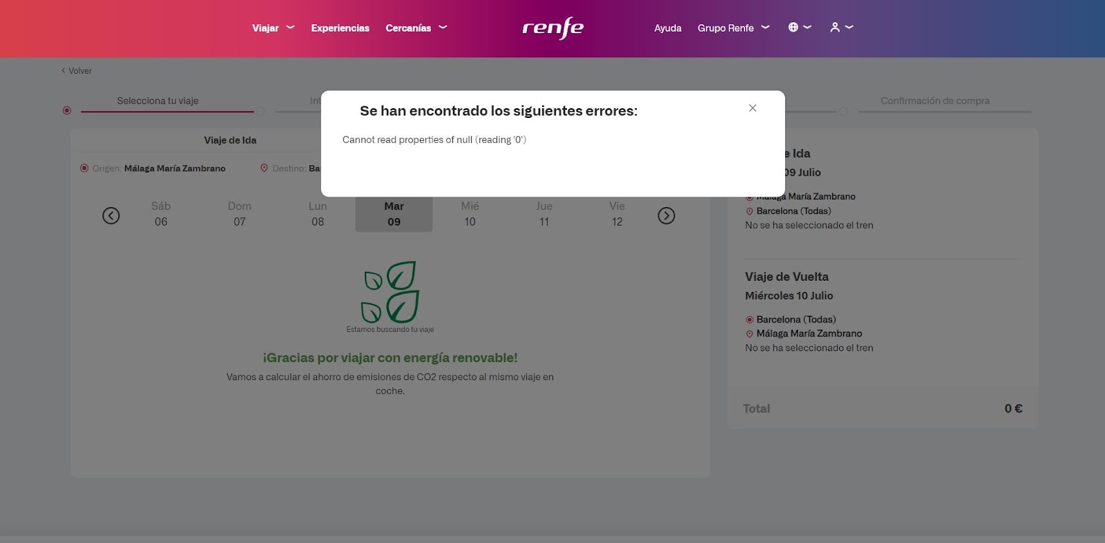
A few days ago, Adrià, CEO of Boost, shared a common yet significant experience while trying to buy a train ticket on the Renfe website. Everything seemed to be going fine until, at the critical moment, right in the middle of the purchase process, an unexpected error message appeared out of nowhere: The following errors were found: Cannot read properties of null (reading 0').
For the average user, this message is little short of a riddle. What does it mean? What should the user do to fix it? The answer to these questions is as hazy as the message itself. The only thing left to do is close the pop-up and hope it is not a catastrophic failure. The resulting frustration can lead to abandoning the purchase, which translates into a direct loss of revenue for the company.
This example perfectly illustrates how a single poorly worded error message can ruin the user experience and, consequently, conversion.
When a user encounters an error message, they face an interruption in their browsing or purchase flow. This interruption triggers an immediate emotional reaction, which can range from mild annoyance to total frustration. At that moment, the user needs a solution, not more problems. If the error message is cryptic or does not provide a clear way to resolve the issue, a feeling of helplessness takes over. This is a key factor in making them abandon the purchase process — and possibly the platform entirely.
On the other hand, when an error message is clear, concise and solution-oriented, the situation changes radically. Instead of feeling lost, the user gets the guidance they need to move forward, which not only mitigates the frustration but also increases their trust in the platform. A well-designed error message can turn a negative experience into an opportunity to demonstrate the quality of a company's customer service.
For an error message to be effective, it must meet three essential requirements:
Clarity: The message must be easy to understand. The user needs to know exactly what has happened. Using technical or ambiguous language will only increase confusion. Instead of "Cannot read properties of null (reading 0')", a clear message might be: "There was a problem processing your selection. Please try again."
Solution-oriented: It is not enough to inform the user of an error — it is essential to offer a clear solution. For example, if there is a problem with seat selection, the message should provide specific steps to resolve the issue, such as "Please refresh the page and try selecting your seat again."
Conciseness: The information should be direct and to the point. There is no need to overwhelm the user with unnecessary details or technical jargon. A short, clear message is far more effective.
The relationship between error messages and conversion is direct and significant. A study by the Baymard Institute found that 70.19% of users abandon their shopping carts, and one contributing factor is frustration with the user experience — including poorly handled error messages.
When a website takes care of its error messages, it not only improves the user experience but also increases the likelihood that users will complete their purchases. In an environment where the competition is just one click away, every detail matters, and error messages are a crucial component of the user experience.
If you want to optimise conversion on your website or platform, it is key to pay attention to how your error messages are working. Here are some practical tips:
Evaluate your current messages: Review the error messages currently displayed on your platform. Are they clear? Do they offer solutions? Could they be rewritten more concisely? Involve people from outside the technical team to assess their comprehensibility.
Test and adjust: Implement A/B tests for different versions of error messages and observe which results in fewer abandonments or more conversions. Even a small change can have a significant impact.
Ongoing education: Make sure your development team understands the importance of error messages. It is not just a technical problem — it is a business problem.
User feedback: Provide an option for users to give feedback on error messages. This not only improves the user experience but also gives you valuable information about where you need to make improvements.
Error messages are not simply a technical aspect that can be overlooked. They are a fundamental part of the user experience and have a direct impact on conversion. A poorly designed error message can be the difference between a completed sale and an abandoned cart.
Therefore, if you want to optimise conversion in your online business, start by reviewing and improving your error messages. Remember, conversion is directly tied to the customer experience, and at Boost, we know how to help you perfect every interaction.
Invest in improving the user experience, take care of every detail, and you will see the results speak for themselves.
Are your customers abandoning their cart at the last second? Discover why a progress bar checkout offers immediate benefits to your conversion rate and...
Is your website slow and losing customers? Discover how to improve Web Vitals for conversion. Analyze your e-commerce performance with Scan & Boost and...
Discover how to define CRO hypotheses following the scientific method and integrating AI to scale your sales with Boost.

