Making more strategic, well-founded decisions is something that features on every digital business's wish list for 2025. We all want to start the year with more order, clearer ideas, and decisions that truly have an impact on our business. The challenge is making sure it does not remain merely a good intention.
2025 will be a year that is hard to anticipate. We are barely a few weeks in and the world has already shifted considerably. Faced with such an unpredictable landscape, we only have one option: resilience. Or in other words: solid preparation so we can respond quickly — and correctly — to whatever comes next.
Check out our complete Report on 2025 Trends and discover how to turn your data into impactful business decisions.
Download it for free here →
The only way to ensure your business can respond to any change in demand or supply of your services is through total control of the situation and good visibility of what is happening. Having a clear picture is the solution to responding in time.
In this article we will talk precisely about that: good data visualization so your business can be agile enough to make good decisions based on quality information. And for that, you need a good dashboard.
Why your business depends more than you think on a good dashboard
Digital businesses navigate a sea of data. We live in the information age and all companies handle enormous amounts of data about their customers and the sector in general. But in many cases, that information is not transformed into useful actions for the business.
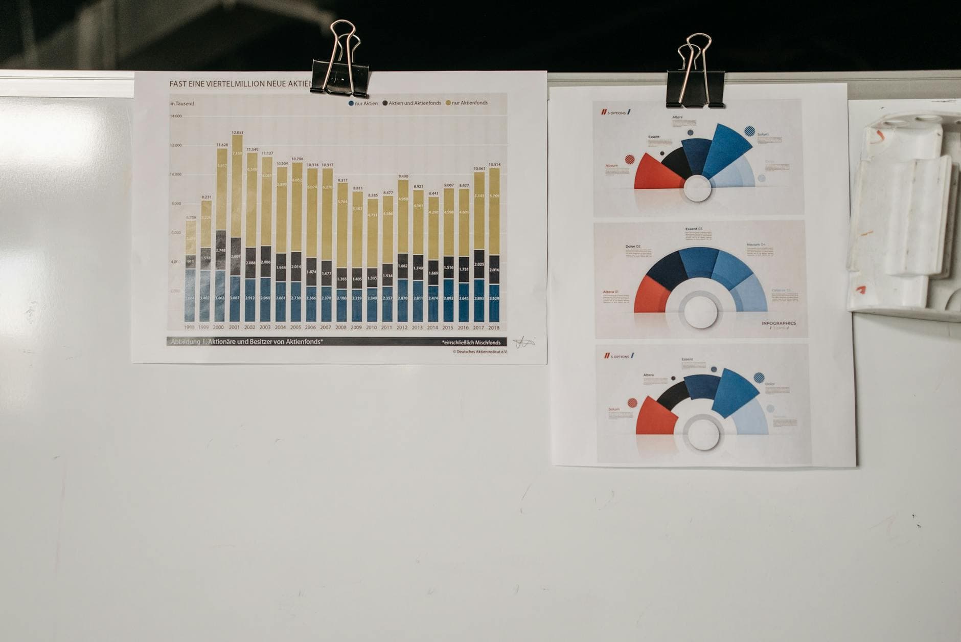
Data visualization dashboards are precisely that bridge connecting data with actionable insights that allow you to make decisions that have an impact on your business. A good data visualization enables you to connect different metrics with each other and turn loose figures into clear information about your business's situation.
Beyond reflecting reality, a good dashboard also lets you get ahead of it. In an environment as constantly changing as ours, having data visualization that is capable of identifying trends in your business — and in the sector in general — is also indispensable.
The advantages of making data-driven decisions (thanks to a good dashboard)
Having the situation under control and being able to identify changes and trends in time is useful for any business. But having a good dashboard also brings advantages for the day-to-day running of your business in more specific ways. In fact, thanks to data visualization you can improve key aspects of your operations:
-
Optimized logistics — Customers are increasingly demanding and efficient operations are key to ensuring the survival of any business. And in such a changing environment, your logistics can fluctuate at any moment. That is why a clear dashboard will allow you to respond to problems in real time and make quick decisions.
-
More precise evaluation — 2025 will be another year of innovations. AI, Augmented Reality, social commerce... And if you are considering investing in any of them, you will need to evaluate their results in an agile and efficient way. Thanks to good data visualization you will be able to easily determine which innovation has a real impact on your key metrics.
-
ROI always on the table — No more shooting in the dark. In addition to deciding which innovations to invest in, you will also have a clearer picture of which marketing (or business) actions are delivering results. Optimizing your ROI is easier when you can attribute sales to every decision you make.
The basic criteria for good data visualization
All right, so it is clear then, right? You build a dashboard with all the data you have available and everything is sorted. Wait, because it is not that simple. Not just any dashboard will do. In fact, one of the most common mistakes is relying on data visualization that is too generic and does not adapt to your business. So here is how to improve that:
- Relevance — It is your business that should determine what information is useful to it, not the other way around. Many data visualization tools will offer you default dashboards that do not always fit your business. That is why you always need to be clear about which metrics are key to you.
→ Question to answer: What do you need to know to make decisions?
- Clarity and simplicity — Once you know what information you need to make impactful decisions, it is time to design a dashboard that keeps your metrics within easy reach. For this, the dashboard must be easy to interpret and use by everyone involved.
→ Question to answer: How should the metrics be displayed and related to each other?
- Real-time availability — Data from a week, a month, or even a day ago is of little use if the decisions you need to make are immediate. Any self-respecting dashboard must provide real-time, up-to-date information.
→ Question to answer: Can I check the current situation at any time?
- Integration — The value of data increases when you can combine it and obtain insights that sync information from different data sources. That is why your visualization dashboard must be able to integrate all your data and combine it to be even more useful.
→ Question to answer: Does my data sync with itself, or am I missing something?
- Flexibility — In the digital environment, everything is constantly changing. New formats, new innovations, new business opportunities... Your data dashboard needs to be adaptable and agile enough to keep pace with your business. A static data visualization will not be useful in the long run.
→ Question to answer: If something changes in my business, does this dashboard still reflect reality and remain useful?
How to start improving your data visualization
Ultimately, your data visualization must meet 3 requirements: be useful to your business, be up to date, and be able to adapt to incoming changes. If you have a dashboard that meets those three criteria, you are ready for 2025. And if not, here is what you can do:
-
Choose the most important metrics — Focus on the KPIs most relevant to your business and aligned with the goals you have set for 2025. Often it is worth designing a dashboard focused on key issues without overcomplicating things.
-
Automate alerts and notifications — The great thing about a dashboard is that, if well designed, it should be able to identify changes and trends without you needing to check it constantly. To get more out of it, set up key alerts for your business.
-
Regularly review the dashboard design — An adaptable and flexible dashboard also depends on you. That is why you need to make sure you frequently review whether the data visualization your business has is still useful. The key is continuously adapting it to your needs.
Design data visualization that helps you make better decisions with Boost
Your business deserves a dashboard equal to whatever 2025 has in store. A dashboard that is useful, flexible, and agile enough to respond in time to all the changes, surprises, and trends of the new year.
For now, you can review the 5 trends we have gathered in our report and start thinking about how they might affect your business. And then, contact us to start designing a data analysis and visualization strategy that truly generates an impact on your business and helps you be more strategic.