

optimizacion-conversion5 min read
BNPL: Buy Now Pay Later for ecommerce
Deferred payment reduces cart abandonment by up to 20%. Discover how to implement BNPL in your store and when it actually makes sense.
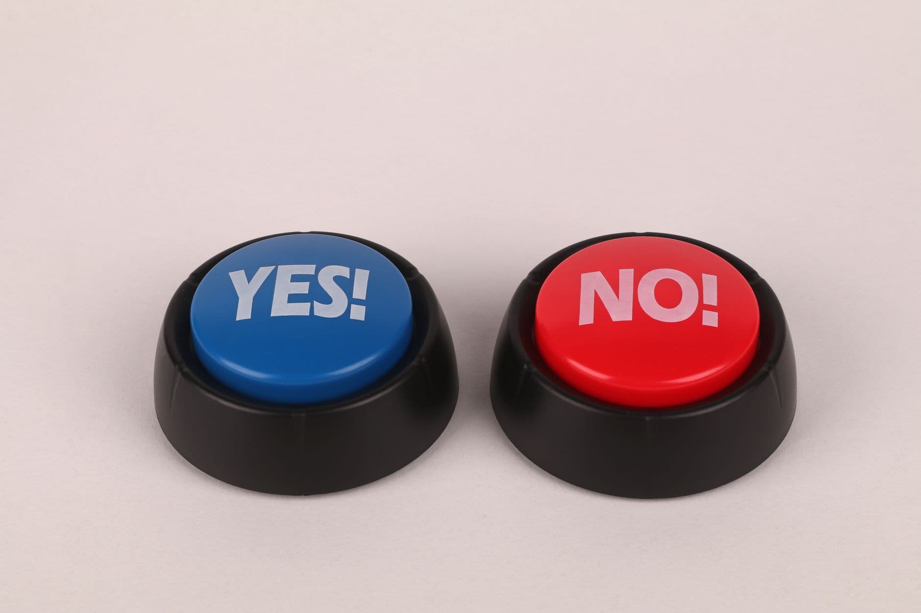
A Call to Action (CTA) is any element on a web page, email, or ad that invites the user to take a specific action. It can be a button, a link, a form, or even a phrase that guides the visitor towards the next step in the conversion funnel.
CTAs are the bridge between the user's interest and the action that generates value for your business. Without clear and effective CTAs, even the best content, the best offer, and the best product fall flat. The visitor arrives, consumes information, and leaves without doing anything.
From a CRO (Conversion Rate Optimisation) perspective, CTAs are one of the elements with the greatest impact on conversion rate. Changing the colour, text, position, or size of a CTA can mean the difference between a 1% conversion rate and a 3% one. And that difference, at scale, translates into thousands or millions of euros.
Not all CTAs pursue the same goal. The type of CTA you need depends on the funnel stage the user is at and the conversion objective you are targeting.
These seek to capture new leads or customers. They appear on landing pages, product pages, and advertising campaigns.
Examples: "Buy now," "Request a quote," "Start your free trial," "Book a demo."
These aim to get the user to interact more with your content or brand, without asking for a high commitment. They are common in blogs, social media, and informational emails.
Examples: "Read more," "Discover how," "See case study," "Download guide."
Oriented towards keeping existing users or customers active. They appear in product dashboards, reactivation emails, and loyalty programmes.
Examples: "Renew subscription," "Upgrade plan," "Invite a friend," "Leave a review."
An advanced technique that offers the user an alternative to the main action, generally phrased so that the option of not acting seems less appealing.
Example: next to "Download free guide" appears "No, I prefer not to improve my conversions." This type of CTA is controversial, but data show it can increase the main CTA's conversion rate by 10% to 30% in certain contexts.
A CTA is not just a button with text. It is a system of elements that work together to generate the desired action.
CTA copy is the most important factor. Best practices based on data from thousands of A/B tests are:
Use first-person action verbs. "I want my discount" converts better than "Get discount." First person creates a sense of ownership and commitment.
Be specific about the benefit. "Download the 47-page guide" converts better than "Download." The user knows exactly what they will receive.
Create urgency without being aggressive. "Reserve your spot (12 left)" is more effective than "BUY NOW." Urgency should be real and credible.
Reduce perceived risk. "Start free, no card required" removes the entry barrier. "Cancel anytime" reduces the fear of commitment.
| Element | Best practice | Why it works |
|---|---|---|
| Colour | High contrast with the background, different from the rest of the page | Attracts immediate visual attention |
| Size | Large enough to be visible, without dominating the page | Facilitates clicking, especially on mobile |
| Shape | Moderately rounded corners (4-8px) | Perceived as more friendly and clickable than sharp corners |
| White space | Generous margin around the button | Visually isolates the CTA and facilitates mobile clicks |
| Icon | Arrow or subtle icon reinforcing the action | Reinforces the direction and expected action |
| Hover state | Colour or shadow change on mouse hover | Confirms it is interactive and clickable |
The position of the CTA on the page determines how many users see it and when. There is no universal rule, but there are proven patterns:
Above the fold: the CTA is visible without scrolling. Works well for direct offers where the user already knows what they are looking for (product pages, campaign landing pages).
After the value pitch: the CTA appears after explaining the benefits. Ideal for products or services that require prior education (SaaS, B2B services, training).
Repeated CTAs: placing the same CTA at the beginning, middle, and end of a long page increases conversion opportunities without being intrusive.
Sticky CTAs: a fixed button at the bottom of the screen (especially on mobile) that accompanies the user while scrolling. Data show sticky CTAs can increase mobile conversion rate by 5% to 20%.
What surrounds the CTA is almost as important as the CTA itself. The most effective supporting elements are:
These elements work at a subconscious level to reduce user anxiety at the moment of decision. In our CRO projects at Boost, reassurance micro-zones next to the purchase button are one of the highest-impact actions in e-commerce.
Hypothesis: changing the CTA copy from "Get your free trial" to "I want my free trial" will increase the conversion rate because first person creates a greater sense of ownership.
Result: the first-person variant generated +28% in CTA click-through rate. This pattern has been replicated across multiple industries and contexts.
Hypothesis: changing "Submit" to "Receive my personalised quote" on a B2B contact form will improve conversions because it clearly communicates the benefit of completing the form.
Result: +34% in form submissions. The specific CTA eliminated uncertainty about what would happen after clicking.
Hypothesis: changing the CTA colour from corporate blue to orange will increase visibility and clicks because orange has higher contrast with the rest of the page.
Result: +21% in conversion rate. Orange does not convert better than blue per se. What converts is contrast. If your entire page is orange, a blue button will work better.
Hypothesis: adding a sticky "Add to cart" button on the mobile product page will improve conversions because the original CTA disappears when scrolling.
Result: +15% in mobile add-to-cart rate. On desktop there was no significant difference, confirming the problem was specific to the mobile experience.
In email, the CTA competes with user inertia. The keys are:
A landing page exists for a single purpose: to convert. Everything on it should point to the CTA.
In e-commerce, the main CTAs are "Add to cart" and "Buy now." The most effective optimisations include:
The form submit button is a CTA that many teams overlook. "Submit" is generic and communicates no value. The alternatives that work best specify the outcome: "Receive my free audit," "Reserve my spot," "Access the guide."
| Metric | What it measures | Indicative benchmark |
|---|---|---|
| CTR (Click-Through Rate) | % of users who see the CTA and click | 2-5% in emails, 5-15% on landing pages |
| Conversion rate | % of users who complete the action after clicking | Varies by industry and action |
| Scroll depth | % of users who reach where the CTA is placed | 50-70% reach mid-page |
| Heatmap clicks | Visual distribution of clicks on the page | The CTA should concentrate the majority of clicks |
| Time to click | Average time from page load to first CTA click | Lower is better, indicates proposal clarity |
When everything is important, nothing is. A page with 5 different CTAs competing for the user's attention creates decision paralysis. Define one primary CTA and, at most, one secondary.
"Submit," "More information," "Click here" are CTAs that say nothing about what the user will get. Every CTA should answer the question: what do I gain if I click?
A CTA that blends in with the rest of the page is an invisible CTA. Visual contrast is essential. If you have to search for the button, there is a problem.
On mobile, the clickable area should be at least 44x44 pixels (per Apple's guidelines). Fingers are less precise than a mouse. A small button on mobile generates frustration and abandonment.
The most serious mistake of all. Best practices are a starting point, not a guarantee. What works in one industry may not work in another. What works with one audience may not work with another. The only way to know which CTA converts best in your specific context is to test it.
Optimising CTAs through A/B testing is one of the highest-return CRO actions. The process is systematic:
Analyse current data. How many users see the CTA? How many click? How many convert? Heatmaps and session recordings reveal whether the problem is visibility, copy, or position.
Formulate a hypothesis. "If I change X to Y, the conversion rate will improve because Z." The hypothesis must be specific and testable.
Design the variant. Change one variable per test to correctly attribute results. If you change colour, copy, and position at the same time, you will not know what caused the improvement.
Run the test with sufficient traffic. An A/B test needs to reach statistical significance (usually 95% confidence) before declaring a winner. This requires a minimum volume of visitors and conversions.
Implement the winning variant. If variant B wins, it is implemented as the new default version. And the next test begins.
Document the learning. Every test, whether it wins or loses, generates a learning. Documenting it allows the team to accumulate knowledge and avoid repeating tests already done.
CTAs are not aesthetic details. They are business decisions. Every word, every colour, every pixel of margin affects how many users go from visitors to leads, from leads to customers, from customers to promoters.
CTA optimisation is one of the highest-impact actions in any CRO programme because it combines a relatively low implementation effort with significant improvement potential. A single copy change on a CTA can generate a double-digit conversion increase.
There is no universally perfect CTA. There is the right CTA for your audience, your product, and your context. And the only way to find it is to test, measure, and improve iteratively.
Want your CTAs to convert more? At Boost, we optimise every element of your website with data and A/B testing. Audit your website for free with Scan&Boost and discover where your biggest improvement opportunities are.
Adrià Vidal is the founder of Boost. +1,000 optimisation actions, +47.8% average conversion increase per client, +7.8M EUR in additional revenue generated.
Deferred payment reduces cart abandonment by up to 20%. Discover how to implement BNPL in your store and when it actually makes sense.
A well-designed popup at the moment of exit can recover between 15% and 30% of the revenue you were about to lose. Here's how to do it right.
CRO explained for executives: why to optimize before investing in traffic, which metrics to track, how to evaluate an agency and a sample ROI case.

